What’s one word that describes your overall vision for Opposite Wall in 2025?
Seasonality. That’s probably the heart of what I’m aiming for in 2025: a seasonally driven group of collections that really help people tell their story in real time. We’re introducing many more smaller collections that will act as timely touchpoints throughout the year. We’re also going to have a bigger roster of international guest artists, expanding the Opposite Wall community through new artist-driven collections that I can’t wait to introduce to our audience.
What are a couple of decor trends you see on the horizon?
One I’m really excited about is exuberant minimalism. I love the idea of paired back expressions. Maximalism can be too much for a lot of people — they fear the overuse of pattern and colour, and I think that can be alienating as a trend. A lot of people want to have bright, joyful expressions in their home but they don’t know how to balance that with a more minimal aesthetic. With its bright colours and controlled forms, exuberant minimalism is the best of both worlds.
The second is nostalgia. For me, nostalgia is really key when we’re building a home. Home is all about creating a space you feel comfy in. Nostalgia can be a great lever to harken back to a time that made you feel good. In our 2025 collections we’ll be using nostalgia in interesting ways, for example by using traditional printmaking techniques but applying them to modern subject matter.
What energy is Opposite Wall looking to bring into people’s homes this year?
Everyone needs art that feels right, right now. You don’t have to invest thousands of dollars into pieces that will be with you forever. It can be, “this season, I want colourful works that will bring happiness into my home.” Or, “I’m really stressed out at work right now, I need art that’s calming and moody to relax me.” We’re offering that option now with all these timely collections, and with our frames that make swapping out the art that’s within them so effortless and quick, you can do it every week, if you want.
What’s one update you’re going to make in your own home in the next while?
I’m going to repaint my bedroom. I have all these soothing blue tones now, but I’m going to swap it out for these really rich warm red tones, like persimmon red. I have dark navy floral bedding, so the red will pop really well.
What’s your favourite colour right now?
In general it’s a nearly fluorescent red-orange colour; it’s really electric and full of energy. It’s a hue that appears in our frames — in the colour Poppy. I also love a good tonal green. Any kind of green, actually, because it’s very living and fresh. Greens help me get through wintertime.
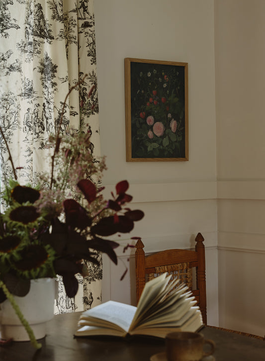
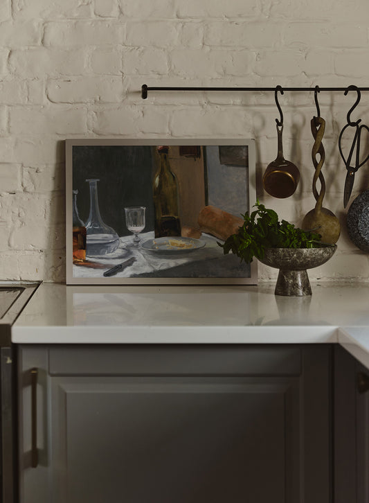
What collection are you most proud of from 2024?
I loved Moody Minimalist. We took paintings from the 18th and 19th centuries and gave them a new lease on life. We reformatted them, cropped them and reworked details so they could be printed on a large scale. For me it was super cool to be able to have artwork like that in my home.